When it comes to interpreting stock price charts, it’s important to pay attention to how the price data is displayed. While different chart scaling methods used for price charts may seem like an unimportant detail, they can dramatically affect how you perceive the numbers – and the markets.
In the video above, I used logarithmic scales (log scales) to display stock price charts, citing historical examples of famous company stock prices over time to explain when it might be best to buy, sell, or hold your stock. A log scale is often the best way to accurately interpret this kind of data – but why use a log scale? When would you choose to use a log scale versus a linear scale? What are some benefits to log chart methods?
In this article, I’ll explain the difference between these two measurements and how they can affect your interpretation of market changes.
What Is a Log Scale?
A log scale displays numerical data over a very wide range of numbers, by making them more compact. The log scale is non-linear, which means as you move along the scale, the number has been multiplied by a fixed factor – often by 10 or 100. In other words, the distance between $2 and $4 is the same as the distance between $200 and $400. The largest numbers in the data can be hundreds (sometimes thousands) of times larger than the smallest numbers.
In simpler terms, a log scale allows you to view the percentage increase instead of the absolute dollar increase, since each point on the vertical axis is a multiple of the point below it.
Logarithmic Price Scale vs. Linear Price Scale
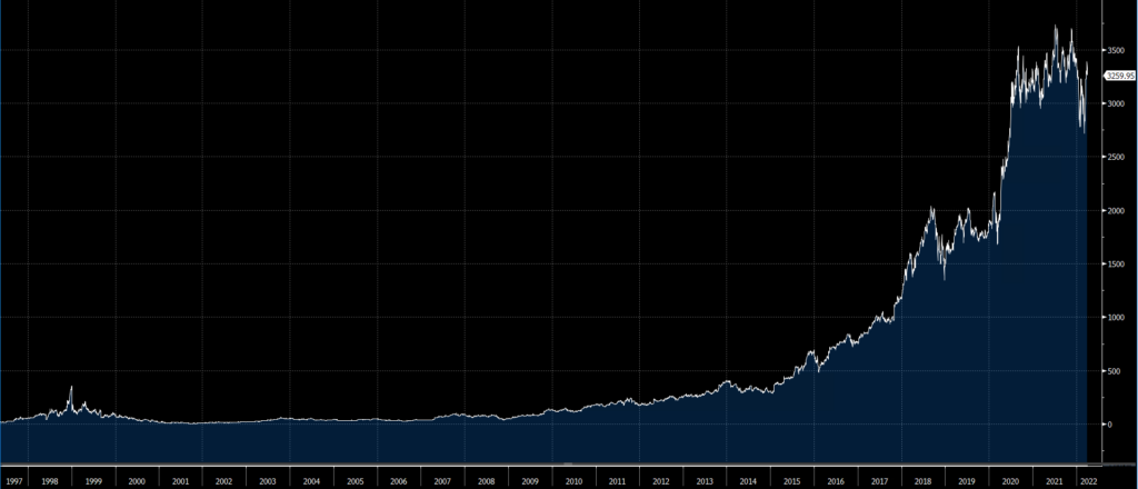
Let’s look at an example of a log scale vs. a linear scale in action. If we look at Amazon’s stock price between 1997 and the start of 2022, a standard linear price chart could lead you to believe that it did not perform very well in the 2000s.

According to this linear scale chart, it appears as though the stock price remained steady, or only increased very slightly, over the first decade of the 2000s.
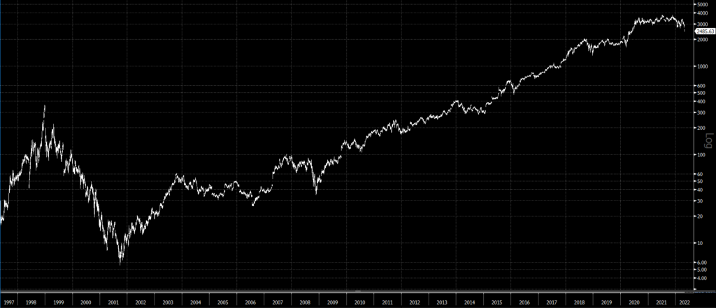
However, this interpretation could not be further from the truth. Using a log scale below, we can clearly see a different story. The change in scale puts the extreme values in perspective by dampening the effect of the high dollar numbers.

Advantages of the Logarithmic Scale
The main reason why a log scale helps us to interpret the data differently is because we typically analyze stock performance by the percentage increase or decrease. If we hold shares of two companies, and one is worth $20 per share and the other is worth $200 per share, an increase of $20 for both stocks does not mean the same thing for each. We instead want to know which one doubled or had the best performance on a percentage basis.
Disadvantages of the Logarithmic Scale
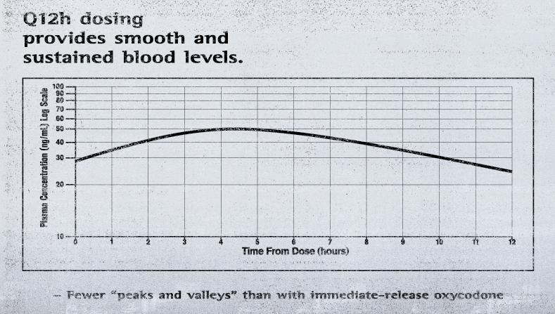
You must also be careful. Logarithmic scales are obviously not always the best way to interpret data, and they can be misleading if used incorrectly. One infamous example is Purdue Pharma’s use of a log scale to convince doctors and patients that OxyContin was much less addictive than other opioids. Just like the 2000s period on the first Amazon chart above, the line is much smoother than it should be. As you can see below, Purdue even had a caption misleadingly interpreting the log scale chart as proof that the drug’s levels in patients’ blood did not drop off sharply. The miniseries “Dopesick” on Disney+ clearly shows the disastrous effects of misconstruing the data this way.

Using a log scale is not practical for every data range, and it will not show much of a difference on a short-time horizon chart. However, when it comes to analyzing stock price charts – especially if you’re comparing them over a long time horizon – you’ll want to consider using a log scale so you can reduce the effects of skewing towards large dollar values, and show percentage changes more clearly.
After all, understanding how certain stock prices have increased or decreased in value over time is critical for determining your investing strategy.


